In the vast digital landscape, developers are the architects and builders who shape the online world we inhabit. Their expertise is crucial in creating functional, visually appealing, and user-friendly websites and applications. While developers traditionally focus on code, algorithms, and functionality, a critical aspect often overlooked is the impact of fonts and typography on the overall user experience.
Fonts and typography play a vital role in shaping how information is perceived, consumed, and understood by users. Just as the choice of words can evoke different emotions, the right font selection and typographic treatment can significantly enhance the visual appeal and legibility of digital content. Consequently, developers who understand the nuances of fonts and typography possess a powerful toolset to create compelling digital experiences.
Typeface vs. font
The actual printing blocks used by original typesetters belong to a font. The style of the text, however, is generally thought of as the typeface (or just “face”). If you want to get OO about it, a font is the instance of a typeface.
So for example, in this diagram below, “Roboto” is the typeface, whereas “Roboto bold” is a particular font:
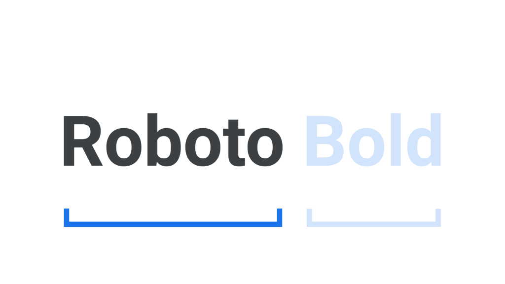
Sometimes a typeface is called a font family.
The individual characters are known as glyphs. For example, the character “a” may be represented by two different glyphs:
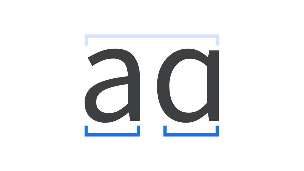
So a modern font maps Unicode character IDs to their glyphs. Hence a font includes a database of glyphs.
Leading and Kerning
Leading (pronounced like the element “lead” because it comes from the strips of lead used by those original compositors between each row; you can just about make them out in that picture below) is the distance between two lines of text, baseline to baseline. Presentation systems will often refer to this as “Line Height”. Tweaking this can make your long text fit in their boxes, or make the text look quite wrong. Worse, until you see lines with enough clashing ascenders and descenders, you might mistakenly think it is ok.
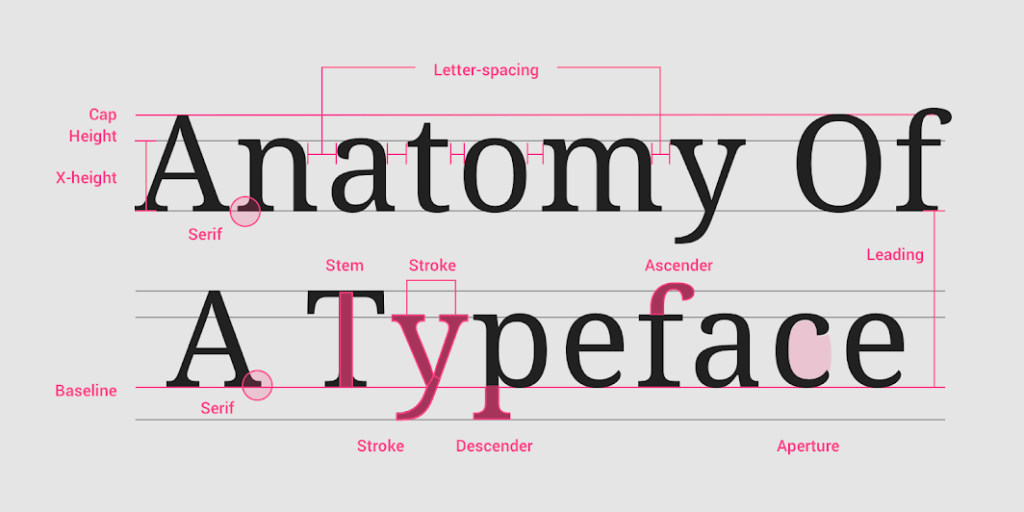
The term tracking is used to describe the process of proportionally spacing out all the letters in a word:
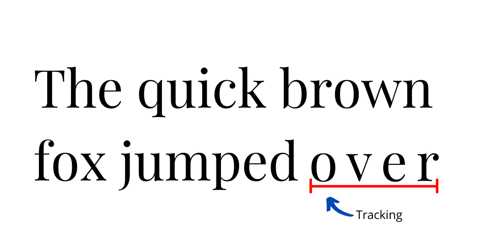
But kerning is the letter spacing between certain pairs of letters that the human eye just likes. Again, these qualities were discovered by the first typesetters on their hot metal presses.
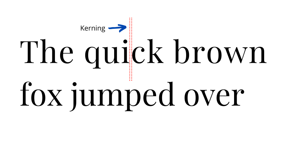
These differences are important yet unpredictable. The reason they matter to engineers is that occasionally, we like to use non-proportional fonts (like Courier) in order to get a terminal-like look, with fixed spacing that might be convenient, yet we forget that the resulting text may be unreadable.
Note that this is different from justification, which uses space between words to stretch a line so that it fits flush against one or both margins:
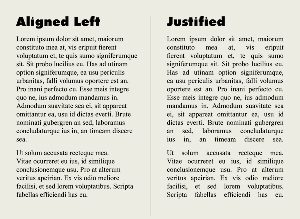
Mostly we read text aligned left with a ragged edge, although newspaper columns can still be fully justified. Justification can give a cleaner, more formal look overall, even if the space interruption looks odd. Typesetters can also put space between the letters in words (hence the need for tracking) to enhance the effect.
Serif vs. Sans Serif
A serif is a decorative line or taper added to the beginning and/or end of a letter’s stem, which creates small horizontal and vertical planes within a word. That is “feet” or “tails”
And my high school French is good enough to work out that “sans serif” means without these tails. (sans = without in French!)
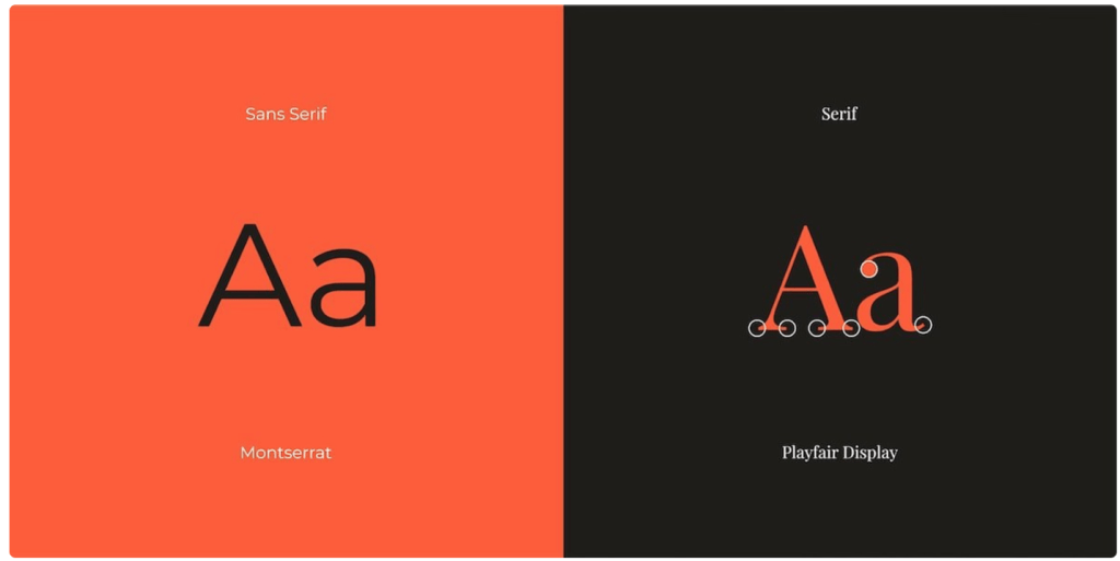
Now from a design point of view, serif fonts look “old and established” whereas sans-serif fonts look “modern”. So authoritative newspapers like to keep to serif fonts (Times refers to both a font and a newspaper) whereas most websites like the space left between sans-serif faces such as Arial or the original Helvetica.
By delving into the world of fonts and typography, developers can collaborate effectively with designers, enabling them to bring their creative vision to life while ensuring optimal functionality and user experience. The ability to choose appropriate fonts, adjust typographic elements, and implement best practices empowers developers to create visually appealing interfaces that engage and captivate users.

