
It may be a little surprising that Swift did not have a tip framework upto now! WWDC 2023 announced the release of a new iOS framework called TipKit!
So what is TipKit all about? The goal of TipKit is to make it as easy as possible for developers to display short contextual information that highlights or explains a feature of their app.
To give you a better idea, here are 3 exemples of how these little UI tooltips look like:

For all of us who have been asked to implement tooltips, I’m sure the announcement of TipKit came with a feeling of relief, because you’ve probably experienced how surprisingly challenging that task can be!
There are mostly two reasons why implementing tooltips without the support of a first-party framework is challenging:
First, displaying the tooltips in a way that works across all the combinations of languages and screen sizes without breaking your UI is not easy.
And then, you also want to make sure that you trigger the tooltips at the right time, so that you don’t overwhelm your users. And the business logic behind this tend to get complex really fast.
As you can guess, the reason why many iOS developers got excited by the announcement of TipKit is because it nicely solves both of these issues So let’s have a look at how it looks like in the code!
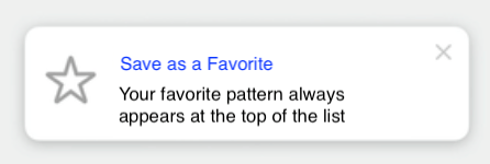
This is the simplest implementation of a Tip: you just need to provide a title and a message. If you want, you can also add an image, typically an icon, through the property asset.
struct FavoriteTip: Tip {
var title: Text {
Text("Save as a Favorite")
}
var message: Text {
Text("Your favorite pattern always appears at the top of the list")
}
var asset: Image {
Image(systemName: "star")
}
}
It’s also possible to display images in the title or the message, because SwiftUI allows you to inline an Image inside a Text!
If needed, you can even configure some actions that your user will be able to trigger:
var actions: [Action] {
[
Tip.Action(
id: "learn-more",
title: "Learn More"
)
]
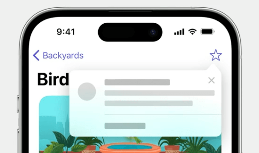
}And once your Tip is configured, you can display it either by embedding it inside a TipView and adding this new view to your view hierarchy. But you can also have your Tip be displayed in a popover that points towards one of your UI element:
So we’ve seen how TipKit helps you display tooltips on your UI, now let’s see how it manages the logic of when to show the tips
First, you have control over the frequency at which tips will be shown to your users:
// One tip per day
TipsCenter.shared.configure {
DisplayFrequency(.daily)
}
// One tip per hour
TipsCenter.shared.configure {
DisplayFrequency(.hourly)
}
// Custom configuration
let fiveDays: TimeInterval = 5 * 24 * 60 * 60
TipsCenter.shared.configure {
DisplayFrequency(fiveDays)
}
// No frequence control. Show all tips as soon as eligible
TipsCenter.shared.configure {
DisplayFrequency(.immediate)
}You can also define rules that will govern how each individual Tip will be displayed.
TipKit supports two kind of rules.
First, you have rules that are based on that current state of your app.
This allows you, for instance, to specify that a Tip should be displayed only when your user is already logged in. And then you have rules based on events being triggered. So if your app already implements analytics, it then becomes very easy to reuse your existing analytics events to configure your Tip!
var rules: Predicate<RuleInput...> {
    // User is logged in
    #Rule(Self.$isLoggedIn) { $0 == true }

    // User has viewed a pattern at least 3 times
    #Rule(Self.patternDetailView) { $0.count >= 3 }
}
That’s it, I think I have covered the basics as an introduction to TipKit. If you want to go further, you can check out both the WWDC Session “Make features discoverable with TipKit” or the framework’s documentation.
 Kenrick Vaz