The Column-Rule Property
CSS columns is a layout method which can divide an element into columns. A common usecase is to divide a paragraph text into two or more columns. The interesting bit is that we can add borders between the columns. The column-rule property name might not reflect it’s purpose, but you can imagine it as a border right!


Background Repeat Round
This property repeats the background in both directions but it never crops the image unless a single image is too large to fit. If multiple tiles can fit, it squishes or stretches appropriately.


Styling List Markers
It’s a perfectly reasonable to want to style the marker of list items. You know: blue bullets with black text in an unordered list. Or red counters with knockout white numbers in an ordered list.


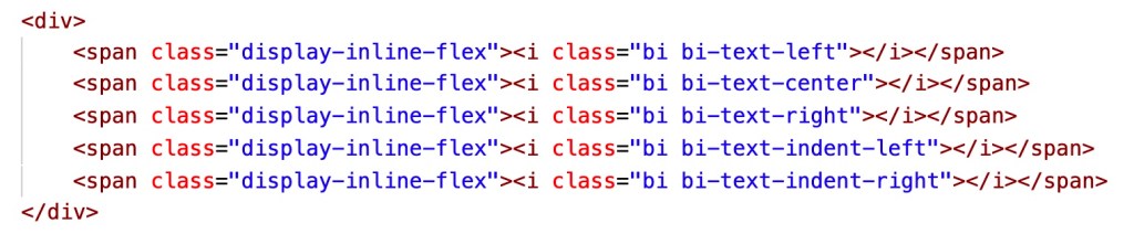
Display: inline-flex
Useful for displaying inline elements with flex functionality.


Object Fit
Object fit is used to specify how an img or video should be resized to fit it’s container.

Margin: Auto with Flexbox
Combined with flexbox, margin: auto can easily center a flex item horizontally and vertically


View source code for all above examples here: Link
 Kenrick Vaz