
With over 6.3 billion global smartphone users, it’s critical mobile apps are inclusive of everyone, including those with vision impairment, hearing limitations, or other physical or cognitive conditions.
What do we mean by an accessible app?
An accessible app means that most people can use it without help from another person, regardless of ability or situation. When there’s a mismatch between the app and the users’ abilities, an app is considered inaccessible.
Web Content Accessibility Guidelines (or WCAG), as the name suggests is a guideline for making your web content or app accessible. The guidelines help you build your app so it’s consumable to a wide range of people. It doesn’t address every user’s needs but it covers the main points and best practices. Even though the guideline’s title suggests they are for the “web”, they’re useful for mobile too.
Mobile application accessibility especially matters because of the ways users interact with content. Mobile apps drive engagement, boost customer loyalty, and give brands more options for personalization of their experiences, so the implications of providing an inaccessible experience might be magnified.
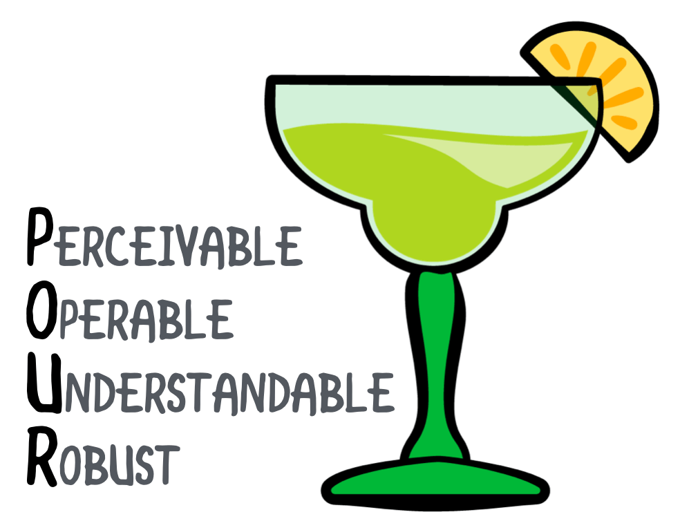
WCAG uses a lovely little acronym to categorize the principles of the requirements:
- P erceivable
- O perable
- U nderstandable
- R obust
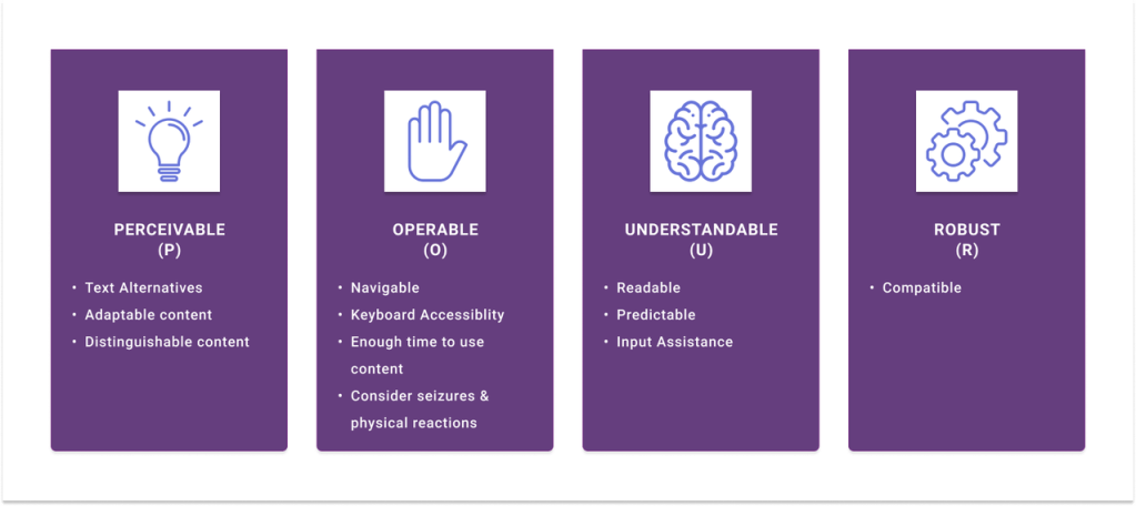
PERCEIVABLE
Information and user interface components must be presented to users in ways they can perceive. This means that users must be able to comprehend the information being depicted: It can’t be invisible to all their senses.
OPERABLE
User interface components and navigation must be operable: The interface cannot require interaction that a user cannot perform.
UNDERSTANDABLE
Information and the operation of a user interface must be understandable: Users must be able to understand the information as well as the operation of the user interface.
ROBUST
Content must be robust enough that it can be interpreted reliably by a wide variety of user agents, including assistive technologies: As technologies and user agents evolve, the content should remain accessible.
So how do we achieve mobile app accessibility?
Here is a 6 step checklist which covers six inclusive design best practices for mobile apps that a mobile app designer or developer should focus on to ensure accessibility and usability.
1. Design for Varying Screen Sizes
Smaller screens and custom aspect ratios are hallmarks of mobile devices; designers need to account for them when building native apps. A smaller screen limits how much information people can take in at one time, especially when users need to magnify content due to poor vision.
Tips for helping users make the most of small screens include:
- Minimizing the amount of information on each page (compared with a desktop or laptop) by providing a dedicated mobile website or designing the site responsively
- Providing a reasonable default size for content and touch controls to minimize the need to zoom in and out for users with low vision
- Adapting the length of link text to the viewport width
- Positioning form fields below, rather than beside, their labels
2. Focus on Touch Targets and Placement
Higher resolution in mobile devices allows for multiple interactive elements to display together on a small screen. But these elements must be large and distanced enough so that users can easily target them by touch.
Tap targets within an app should be big enough for people to interact with precision and confidence, even when they have to perform tasks in a hurry.
Best practices for touch target size include:
- Designing touch targets to be at least 9 mm high by 9 mm wide
- Adding inactive space surrounding smaller touch targets (closer to minimum size above)
Mobile applications should also position interactive elements where they can be easily reached regardless of how the device is held. Developers should consider how an easy-to-use button placement for some users might cause difficulties for others (e.g., left- versus right-handed use, assumptions about thumb range of motion).
Tips for touch target placement include:
- Place buttons where they are easy to access.
- Allow flexible use for all interactive elements.
3. Keep Device Gestures Simple and Provide Ample Feedback
Most mobile devices are designed to be operated primarily through gestures on a touchscreen. These gestures can be simple (such as a one-finger tap) or complex (involving multiple fingers, multiple taps).
Gestures used to control native apps should be as easy to execute as possible. Complex gesture control can be particularly challenging for users with motor or dexterity impairments. Create alternatives to allow simple tap or swipe gestures in place of more complex ones.
In addition to simpler gesture control, native apps should be designed so that users can easily go back and fix their course in case of unintentional actions such as accidental clicking. For example, if a user swipes their finger on the wrong part of the application, they should be able to easily go back and access the correct interactive elements.
4. Ensure Consistent Layouts and Templates
Components that are repeated across pages in a mobile application should be presented in a consistent layout.
For example, a native application has a logo, a title, a search form, and a navigation bar. At the top of each page, these elements appear in the same relative order and position. When the app is viewed on a smaller screen in portrait mode, the navigation bar collapses into a single icon with a drop-down list, but the elements in that list are still in the same order.
Consistency is key to creating seamless cross-channel user experiences. It helps the user feel comfortable and in control while executing tasks, including those that may start on one device and finish on another.
5. Provide Easy Methods for Data Entry
Users can enter information in various ways on their mobile phones, including the on-screen keyboard, a bluetooth keyboard, and speech. Text entry can be time-consuming and difficult for some users, but it can be displaced through other data entry styles. Reduce the amount of text entry required by providing select menus, radio buttons, or check boxes, or by auto-filling known information.
Typing is a slow method of data entry. Providing alternatives such as autofill, data sharing between apps, or dictation improves the overall app experience and prevents errors.
6. Double-Check Color Contrast
WCAG outlines general color contrast ratios that are acceptable for most users, but extra attention must be paid to mobile devices and applications. Mobile devices are more likely to be used outdoors, where glare from the sun could impact ability to see the screen. Using good contrast is important for all users; bad contrast can compound the challenges that people with reduced vision have when accessing content on mobile devices.
Text legibility is preserved by an adequate contrast between the font color and the background. For WCAG 2.1 AA compliance, text should have a color contrast ratio of at least 4.5:1 (larger text at least 3:1). Allowing different contrast ratios for larger text is useful because wider character strokes are easier to read at a lower contrast than narrower character strokes. This allows designers more leeway for contrast, which is helpful for elements such as titles. But because app content is viewed on smaller screens and in different conditions, this allowance for lessened contrast on large text becomes complicated.
7. Give Proper Labels to UI Elements
UI elements such as images, buttons, and other controls should be labeled appropriately to be recognizable by assistive technology, such as the iOS Voiceover or Android TalkBack.
Many developers focus on app features, leaving accessibility as an afterthought. However, development teams shouldn’t overlook accessibility or view it as a last-minute task carried out at the end of the release. Doing this is inefficient and costly. To build an accessible app, you must weave in accessibility at the beginning of the app design and development.
I’ll end with this lovely infographic I came across which summarizes things nicely!

Very interesting :)
LikeLiked by 1 person