
In the ever-evolving landscape of web development, the language of design undergoes constant refinement. CSS, the style sheet language that breathes life into the digital realm, is no exception. Sometimes, improving your CSS just takes a one-line upgrade or enhancement! Learn about 10 properties to start incorporating into your projects, and enjoy reducing technical debt, removing JavaScript, and scoring easy wins for user experience. Fasten your seatbelts as we embark on a journey through the transformative world of modern CSS upgrades!
aspect-ratio
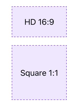
As of September 2021, the aspect-ratio property is stable in evergreen browsers and is the only property needed to define an aspect ratio. For an HD video, you can just use aspect-ratio: 16/9. For a perfect square, only aspect-ratio: 1 is required since the implied second value is also 1 .
.aspect-ratio-hd {
aspect-ratio: 16/9;
}
.aspect-ratio-square {
aspect-ratio: 1;
}
An applied aspect-ratio is forgiving and will allow content to take precedence. This means that when content would cause the element to exceed the ratio in at least one dimension, the element will still grow or change shape to accommodate the content. To prevent or control this behavior, you can add additional dimension properties, like max-width, which may be necessary to avoid expanding out of a flex or grid container.
/* Applied to the flexbox children which have a size constraint from their parent */
.aspect-ratio-square {
  aspect-ratio: 1;
}
object-fit
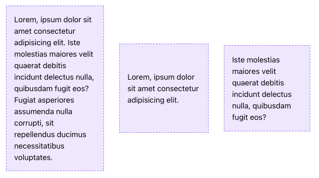
The use of object-fit causes an img or other replaced element to act as the container for its contents and have the contents adopt resizing behavior similar to background-size.
While there are a few values available for object-fit, the following are the ones you’re most likely to use:
- cover – the image resizes to cover the element, and maintains its aspect-ratio so that the content is not distorted
- scale-down – the image resizes (if needed) within the element so that it is fully visible without being clipped and maintains its aspect-ratio, which may lead to extra space (”letterboxing”) around the image if the element has a different rendered aspect-ratio
In either case, object-fit is an excellent property pairing with aspect-ratio to ensure images are not distorted when you apply a custom aspect ratio. Let’s look at an example
.image {
object-fit: cover;
aspect-ratio: 1;
/* Optional: constrain image size */
max-block-size: 250px;
}
margin-inline
One of many logical properties, margin-inline functions as a shorthand for setting the inline (left and right in horizontal writing modes) margin.
The replacement here is simple:
/* Before */
margin-left: auto;
margin-right: auto;
/* After */
margin-inline: auto;text-underline-offset
The use of text-underline-offset allows you to control the distance between the text baseline and the underline. You can use this offset to clear descenders as well as improve legibility, particularly when links are grouped in close proximity, such as a bulleted list of links.
This upgrade may replace older hacks like a border or pseudo-element, or even a gradient background
a {
    text-underline-offset: 0.25em;
}
outline-offset
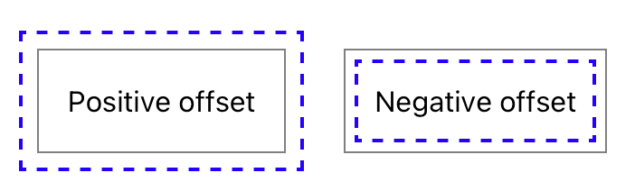
We’ve been using different hacks including box-shadow or perhaps a pseudo-element to supply a custom outline when you wanted distance between the element and outline on focus?
The long-available outline-offset property may be one you missed, and it enables pushing the outline away from the element with a positive value or pulling it into the element with a negative value.
In the example below, the gray solid line is the element border, and the blue dashed line is the outline being positioned via outline-offset.
.outline-offset {
  outline: 2px dashed blue;
  outline-offset: var(--outline-offset, .5em);
}
One key point is that outlines are not computed as part of the element’s box size, so increasing the distance will not increase the amount of space an element occupies. This is similar to how box-shadow is rendered without impacting the element size as well.
Stay tuned for part 2!
 Kenrick Vaz