
We continue our journey through the transformative world of modern CSS upgrades!
color-scheme
You may be familiar with the prefers-color-scheme media query to customize dark and light themes. The CSS property color-scheme is an opt-in to adapting browser UI elements including form controls, scrollbars, and CSS system colors. The adaptation asks the browser to render those items with either a light or dark scheme, and the property allows defining a preference order.
If you’re enabling adapting your entire application, set the following on the :root, which says to preference a dark theme (or flip the order to preference a light theme).
:root {
    color-scheme: dark light;
}
You can also define color-scheme on individual elements, such as adjusting form controls within an element with a dark background for improved contrast.
.dark-background {
    color-scheme: dark;
}
accent-color
I’m sure that at some point you’ve wanted to change the color of checkboxes or radio buttons. What you’ve been looking for is accent-color!
With this property, you can modify the :checked appearance of radio buttons and checkboxes and the filled-in state for both the progress element and range input. The browser’s default focus “halo” may also be adjusted if you do not have another override.
:root {
  accent-color: mediumvioletred;
}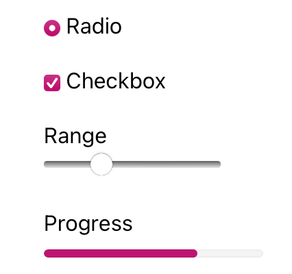
Consider adding both accent-color and color-scheme to your baseline application styles for a quick win toward custom theme management.
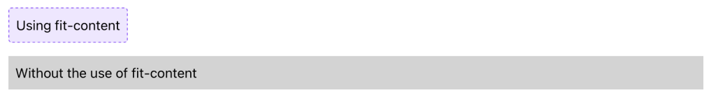
width: fit-content
One of my favorite CSS hidden gems is the use of fit-content to “shrink wrap” an element to its contents.
Whereas you may have used an inline display value such as display: inline-block to reduce an element’s width to the content size, an upgrade to width: fit-content will achieve the same effect. The advantage of width: fit-content is that it leaves the display value available, thereby not changing the position of the element in the layout unless you adjust that as well. The computed box size will adjust to the dimensions created by fit-content.
Let’s see how it works
.fit-content {
  width: fit-content;
}
overscroll-behavior
The default behavior of contained scroll regions – areas with limited dimensions where overflow is allowed to be scrolled – is that when the scroll runs out in the element, the scroll interaction passes to the background page. This can be can be pretty frustrating for your users.
Use of overscroll-behavior: contain will isolate the scrolling to the contained region, preventing continuing the scroll by moving it to the parent page once the scroll boundary is reached. This is useful in contexts such as a sidebar of navigation links, which may have an independent scroll from the main page content, which may be a long article or documentation page.
.sidebar, .article {
  overscroll-behavior: contain;
}
text-wrap
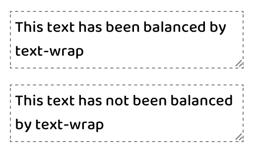
One of the newest properties (as of 2023) is text-wrap, which has two values that solve the type-setting problem of unbalanced lines. This includes preventing “orphans,” which describes a lonely word sitting by itself in the last text line.
The first available value is balance, which has a goal of evening out the number of characters per line of text.
There is a limitation of six lines of wrapped text, so the technique is best used on headlines or other shorter text passages. Limiting the scope of application also helps limit the impact on page rendering speed.
:is(h1, h2, h3, h4, .text-balance) {
text-wrap: balance;
/* For demonstration */
max-inline-size: 25ch;
}
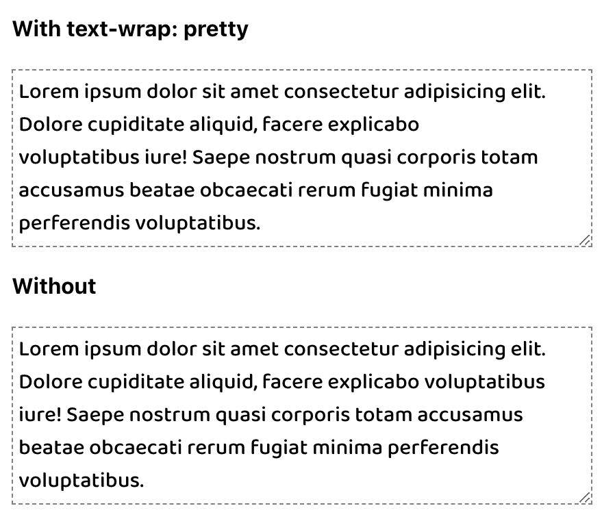
The other value of pretty specifically addresses preventing orphans and can be more broadly applied. The algorithm behind pretty will evaluate the last four lines in a text block to work out adjustments as needed to ensure the last line has two or more words.
p {
text-wrap: pretty;
/* For demonstration */
max-inline-size: 35ch;
}
Hope this helps you! Have I missed anything? Let me know in the comments below :)
 Kenrick Vaz