Duck or Eagle?

I was at the airport when a taxi driver approached.

The first thing I noticed in the taxi was a sentence, that I read: Duck or Eagle? You decide!

The second thing I noticed was a clean & shiny cab, the driver well dressed, white shirt & pressed pants, with a tie.

The taxi driver got out, opened the door for me & said: “I am John, your chauffeur.While I keep your luggage, I would like you to read on this card what my mission is.”

On the card was written: John’s Mission: Take my customers to their destination quickly, safely & economically, offering a friendly environment.

I was impressed!

The cab’s interior was equally clean.

John asked me:
“Would you like a coffee?”

Playing with him I said:
“No! I prefer a juice.”

Immediately he replied: “No problem. I have a thermos with regular juice & also diet, as well as water” he also told me: “If you’d like to read, I have today’s paper & some magazines as well.”

When the cab started, John told me: “These are the radio stations I have & this is the repertoire they play.”

As if that wasn’t enough, John asked me if the air conditioning temperature was good.

Then he told me the best route to my destination & whether I wanted to talk to him or whether he preferred that I not be interrupted.

I asked:”Do you always serve your customers like this?”

“No!” He replied. “Not always.
Only in the last two years.
My first years as a taxi driver I spent most of my time complaining like other taxi drivers.
One day I heard a doctor specializing in personal development.
He wrote a book called Who You Are Makes a Difference.
He said: If you get up in the morning expecting to have a bad day, you will!
Don’t be a DUCK! Be an EAGLE!

The ducks only make noise & complain, the eagles soar above the group.

I was all the time making noise & complaining. So I decided to change my attitudes & be an eagle.

I looked at the other taxis & drivers. Dirty taxis, unfriendly drivers & unhappy customers.

I decided to make some changes. Since my customers responded well, I made a few more changes.

In my first year as an eagle, I doubled my income. This year, I already quadrupled.

You were lucky to take my taxi today. I’m no longer at the taxi stand. My clients make reservations on my cell phone or text me. If I can’t answer, I can get a reliable “Eagle” taxi driver friend to do the job.”

John was different. He offered a limousine service in a regular taxi.
John the taxi driver, decided to stop making a noise & complain as ducks do & started to fly over the group, as eagles do.

It doesn’t matter if you work in an office, maintenance, teacher, civil servant, politician, executive, employee or a professional or a taxi driver! How do you behave? Are you dedicated to making a noise & complaining? Or rising above the rest?

Remember: THE DECISION IS YOURS! This key only opens from the inside!

AND EACH TIME YOU HAVE LESS TIME TO CHANGE!

Love your Priests

According to recent studies… many priests quit each year. They don’t quit because they have a lack of faith in God. They don’t quit because they don’t believe in the calling God has placed on their life. Most don’t even quit because of financial reasons.

Priests quit because they are overwhelmed with mental exhaustion.

Until you’re a priest, you’ll never fully understand what it’s like to carry spiritual burdens for people. Getting up in the middle of night, praying for your family of faith. Awakened in the middle of night with someone on your heart. Overwhelmed with concern by a persons absence or distance.

Your mind continually occupied with the presentation of the upcoming Sunday message – how to preach it, what to teach on, how do we apply it? Getting critiqued on a continual basis.

Being told you need to do better or that some areas of the church simply need to be better.
priests invest their whole life into people and yet people will turn their backs on their priests at the first sign of a storm, usually without a conversation. Priests stand in the middle of disputes.
priests stand in the middle of gossip.
Priests council broken marriages.
Priests comfort those who have suffered loss. Priests navigate the waters of imperfect people with a desire to see each one thrive in their faith.

They long for spiritual breakthroughs. Your Priests craves the very best for you. All of this, while trying to battle their own flesh and grow in their own relationship with God.
Priests see the posts.
Priests hear the whispers.
Priests endure the negativity.
Priests are continually caring for the sheep while fending off the wolves.
Priests pour out and pour out – rarely being poured into.

What keeps a Priest going? YOU!

You – the person who is genuinely hungry.
You – the person who worships with passion and freedom.
You – the teenager who is striving to be a follower of Jesus.
You – the single mom who understands the beauty of the hope found in Christ.
You – the one who walks through the door for the first time because you’re in search of peace, hope, and community.

Pray for your Priests. Serve with your Priest.
Talk with your Priest. Encourage your Priest.
They are human. They need You more than you think!

What doesn’t kill you makes you stronger?

My dad and I once had a disagreement over him using the adage
“What doesn’t kill you makes you stronger.”

I said, “That’s just not true. Sometimes what doesn’t kill you leaves you brittle and injured or traumatized.”

He stopped and thought about that for a while. He came back later, and said, “It’s like wood glue.”

He pointed to my bookshelf, which he helped me salvage a while ago.

He said, Do you remember how I explained that, once we used the wood glue on them, the shelves would actually be stronger than they were before they broke?”

I did.

“But before we used the wood glue, those shelves were broken. They couldn’t hold up shit. If you had put books on them, they would have collapsed. And that wood glue had to set awhile. If we put anything on them too early, they would have collapsed just the same as if we’d never fixed them at all. You’ve got to give these things time to set.”

It sounded like a pretty good metaphor to me, but one thing I did pick up on was that whatever broke those shelves, that’s not the thing that made them stronger. That just broke them. It was being fixed that made them stronger. It was the glue.

So my dad and I agreed, what doesn’t kill you doesn’t actually make you stronger, but healing does. And If you feel like healing hasn’t made you stronger than you were before, you’re probably not done healing. You’ve got to give these things time to set.

Modern CSS Upgrades (Part 2)

We continue our journey through the transformative world of modern CSS upgrades!

color-scheme

You may be familiar with the prefers-color-scheme media query to customize dark and light themes. The CSS property color-scheme is an opt-in to adapting browser UI elements including form controls, scrollbars, and CSS system colors. The adaptation asks the browser to render those items with either a light or dark scheme, and the property allows defining a preference order.

If you’re enabling adapting your entire application, set the following on the :root, which says to preference a dark theme (or flip the order to preference a light theme). 

:root {
color-scheme: dark light;
}

You can also define color-scheme on individual elements, such as adjusting form controls within an element with a dark background for improved contrast.

.dark-background {
color-scheme: dark;
}

accent-color

I’m sure that at some point you’ve wanted to change the color of checkboxes or radio buttons. What you’ve been looking for is accent-color!

With this property, you can modify the :checked appearance of radio buttons and checkboxes and the filled-in state for both the progress element and range input. The browser’s default focus “halo” may also be adjusted if you do not have another override.

:root {
accent-color: mediumvioletred;
}

Consider adding both accent-color and color-scheme to your baseline application styles for a quick win toward custom theme management.


width: fit-content

One of my favorite CSS hidden gems is the use of fit-content to “shrink wrap” an element to its contents.

Whereas you may have used an inline display value such as display: inline-block to reduce an element’s width to the content size, an upgrade to width: fit-content will achieve the same effect. The advantage of width: fit-content is that it leaves the display value available, thereby not changing the position of the element in the layout unless you adjust that as well. The computed box size will adjust to the dimensions created by fit-content.

Let’s see how it works

.fit-content {
width: fit-content;
}

overscroll-behavior

The default behavior of contained scroll regions – areas with limited dimensions where overflow is allowed to be scrolled – is that when the scroll runs out in the element, the scroll interaction passes to the background page. This can be can be pretty frustrating for your users.

Use of overscroll-behavior: contain will isolate the scrolling to the contained region, preventing continuing the scroll by moving it to the parent page once the scroll boundary is reached. This is useful in contexts such as a sidebar of navigation links, which may have an independent scroll from the main page content, which may be a long article or documentation page.

.sidebar, .article {
overscroll-behavior: contain;
}

text-wrap

One of the newest properties (as of 2023) is text-wrap, which has two values that solve the type-setting problem of unbalanced lines. This includes preventing “orphans,” which describes a lonely word sitting by itself in the last text line.

The first available value is balance, which has a goal of evening out the number of characters per line of text.

There is a limitation of six lines of wrapped text, so the technique is best used on headlines or other shorter text passages. Limiting the scope of application also helps limit the impact on page rendering speed.

:is(h1, h2, h3, h4, .text-balance) {
text-wrap: balance;

/* For demonstration */
max-inline-size: 25ch;
}

The other value of pretty specifically addresses preventing orphans and can be more broadly applied. The algorithm behind pretty will evaluate the last four lines in a text block to work out adjustments as needed to ensure the last line has two or more words.

p {
text-wrap: pretty;

/* For demonstration */
max-inline-size: 35ch;
}

Hope this helps you! Have I missed anything? Let me know in the comments below :)

Modern CSS Upgrades (Part 1)

In the ever-evolving landscape of web development, the language of design undergoes constant refinement. CSS, the style sheet language that breathes life into the digital realm, is no exception. Sometimes, improving your CSS just takes a one-line upgrade or enhancement! Learn about 10 properties to start incorporating into your projects, and enjoy reducing technical debt, removing JavaScript, and scoring easy wins for user experience. Fasten your seatbelts as we embark on a journey through the transformative world of modern CSS upgrades!

aspect-ratio

As of September 2021, the aspect-ratio property is stable in evergreen browsers and is the only property needed to define an aspect ratio. For an HD video, you can just use aspect-ratio: 16/9. For a perfect square, only aspect-ratio: 1 is required since the implied second value is also 1 .

.aspect-ratio-hd {
aspect-ratio: 16/9;
}

.aspect-ratio-square {
aspect-ratio: 1;
}

An applied aspect-ratio is forgiving and will allow content to take precedence. This means that when content would cause the element to exceed the ratio in at least one dimension, the element will still grow or change shape to accommodate the content. To prevent or control this behavior, you can add additional dimension properties, like max-width, which may be necessary to avoid expanding out of a flex or grid container.

/* Applied to the flexbox children which have a size constraint from their parent */
.aspect-ratio-square {
aspect-ratio: 1;
}

object-fit

The use of object-fit causes an img or other replaced element to act as the container for its contents and have the contents adopt resizing behavior similar to background-size.

While there are a few values available for object-fit, the following are the ones you’re most likely to use:

  • cover – the image resizes to cover the element, and maintains its aspect-ratio so that the content is not distorted
  • scale-down – the image resizes (if needed) within the element so that it is fully visible without being clipped and maintains its aspect-ratio, which may lead to extra space (”letterboxing”) around the image if the element has a different rendered aspect-ratio

In either case, object-fit is an excellent property pairing with aspect-ratio to ensure images are not distorted when you apply a custom aspect ratio. Let’s look at an example

.image {
object-fit: cover;
aspect-ratio: 1;

/* Optional: constrain image size */
max-block-size: 250px;
}

margin-inline

One of many logical properties, margin-inline functions as a shorthand for setting the inline (left and right in horizontal writing modes) margin.

The replacement here is simple:

/* Before */
margin-left: auto;
margin-right: auto;

/* After */
margin-inline: auto;

text-underline-offset

The use of text-underline-offset allows you to control the distance between the text baseline and the underline. You can use this offset to clear descenders as well as improve legibility, particularly when links are grouped in close proximity, such as a bulleted list of links.

This upgrade may replace older hacks like a border or pseudo-element, or even a gradient background

a {
text-underline-offset: 0.25em;
}

outline-offset

We’ve been using different hacks including box-shadow or perhaps a pseudo-element to supply a custom outline when you wanted distance between the element and outline on focus?

The long-available outline-offset property may be one you missed, and it enables pushing the outline away from the element with a positive value or pulling it into the element with a negative value.

In the example below, the gray solid line is the element border, and the blue dashed line is the outline being positioned via outline-offset.

.outline-offset {
outline: 2px dashed blue;
outline-offset: var(--outline-offset, .5em);
}

One key point is that outlines are not computed as part of the element’s box size, so increasing the distance will not increase the amount of space an element occupies. This is similar to how box-shadow is rendered without impacting the element size as well.


Stay tuned for part 2!

Say Hello to NLUX

Conversational AI has taken off, and chatbots powered by large language models (LLMs) like ChatGPT are becoming a must-have for many apps and websites. At Brillio, we already have kicked-off many engagements on conversational AI. As a web developer, you want a simple way to build a great chat interface backed by these incredible LLMs. That’s where NLUX comes in.

NLUX is an open-source React and Vanilla JS library that makes it easy to integrate LLMs like ChatGPT into your app and create natural conversational experiences for your users. With NLUX, you get:

  • Build AI Chat Interfaces In Minutes – High quality conversational AI interfaces with just a few lines of code.
  • React Components & Hooks – <AiChat /> for UI and useAdapter hook for easy integration.
  • Flexible LLM Adapters – ChatGPT HuggingFace and an API to Create Your Own Adapter for any LLM.
  • Bot and User Personas – Customize the bot and user personas with names, images, and descriptions.
  • Streaming LLM Output – Streamed the chat response to the UI as it’s being generated.
  • Syntax Highlighting – Color code snippets in the response. Copy And Paste code into your editor.
  • Personalized Conversation – Provide context using system messages, and instruct the LLM how to behave.
  • Customizable Theme – Easily customize the look and feel of the chat interface using CSS variables.
  • Zero Dependencies – Lightweight codebase, with zero-dependencies except for LLM front-end libraries.

What I liked is the flexibility to develop custom streaming or promise adapters. For example, let’s say an enterprise doesn’t use the public OpenAI large language model, but they want to use a custom model that’s hosted in their own servers. They can actually build and customize their own models, but they still can use NLUX to connect to those models. They need to build a custom adapter for their own model and API.

Developers can personalize their chatbot with natural language queues and a few lines of code to give the conversation a bit of personality. They can also instruct the bot to be serious, funny, modest or confident.

NLUX is also currently building an adapter for LangChain, along with support for server-side rendering. Voice chat is also on the roadmap for the library. They also have plans to expand NLUX to support Angular, React Native and possibly Preact.

Let’s see how easy it is to get up and runningn with NLUX. 

To get started, you can check out the React JS NPM package here or the Vanilla JS NPM package here. Both NPM packages have detailed documentation and examples on how to use them.

I’ll use the react package. To install:

npm install @nlux/react @nlux/openai-react

Then include <AiChat /> in your React app to get started.

Use the useAdapter hook to configure an adapter for your LLM.

import {AiChat} from '@nlux/react';
import {useAdapter} from '@nlux/openai-react';

const App = () => {
const gptAdapter = useAdapter({
apiKey: 'YOUR_OPEN_AI_API_KEY',
// 👇 Instruct ChatGPT how to behave, customize your bot's personality! (optional)
systemMessage:
'Give sound, tailored financial advice. Explain concepts simply. When unsure, ask questions. ' +
'Only recommend legal, ethical practices. Be friendly. Write concise answers under 5 sentences.'
});

return (
<AiChat
adapter={gptAdapter}
promptBoxOptions={{
placeholder: 'How can I help you today?'
}}
/>
);
}

To customize the look and feel of the bot you need include a theme CSS file into your HTML page.

The recommended way for React developers is to install @nlux/themes

npm install @nlux/themes

Then import the theme CSS file into your app or component as follows:

import '@nlux/themes/custom.css';

With NLUX, you can optionally define a bot persona and a user persona. Here is an example

Source: nlux documentation

Pretty cool right? So if you’re looking to add an AI assistant or chatbot to your app, look no further than NLUX. Its simplicity, customizability, and focus on performance makes it the perfect choice.

How to Break Your Cell Phone Addiction

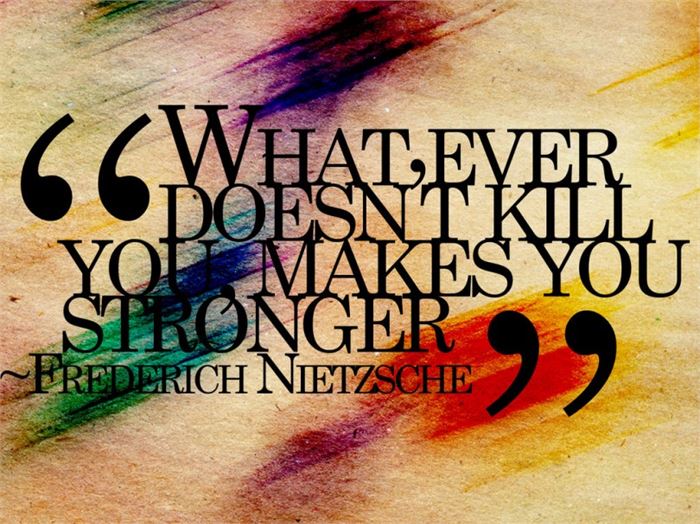
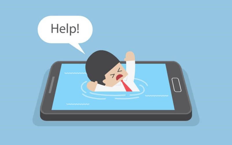
Cell phone addiction, often referred to as “nomophobia” (no-mobile-phone phobia), is a growing concern with implications for mental health and overall well-being. Researchers and health professionals continue to explore the impact of smartphone use on individuals and society. If you or someone you know is struggling with cell phone addiction, seeking support and implementing healthy habits is crucial for maintaining a balanced and fulfilling life.

Here are some general statistics on cell phone addiction:

  1. Global Smartphone Ownership:
    As of 2022, approximately 3.8 billion people worldwide own smartphones.
  2. Daily Smartphone Usage:
    On average, people spend around 3 hours and 15 minutes per day on their smartphones.
  3. Social Media Usage:
    The average user spends about 2 hours and 31 minutes per day on social media platforms using their smartphones.
  4. Screen Time Increase:
    During the COVID-19 pandemic, global daily time spent on mobile devices increased by about 20% in 2020.
  5. App Usage:
    The average number of apps used by a smartphone user is around 30 per month.
  6. Notifications:
    Many smartphone users receive dozens of notifications per day, contributing to constant phone-checking behavior.
  7. Nomophobia:
    Nomophobia, or the fear of being without a mobile phone, affects a significant percentage of the population. Studies suggest that over 70% of people experience some form of nomophobia.
  8. Youth and Cell Phone Addiction:
    Studies show that adolescents spend an average of 6 hours per day on screens, including smartphones.
  9. Impact on Sleep:
    Excessive smartphone use before bedtime can contribute to sleep disturbances. About 75% of smartphone users report using their devices in bed.
  10. Texting Habits:
    The average person sends and receives around 94 text messages per day.

And the impact of this usage is staggering:

  • Reducing the quality of conversations. 
  • Adversely impacting short-term memory and problem solving.
  • Negatively affecting our sleep patterns.
  • Resulting in more negativity, distress, and less emotional recoveryin young children.
  • Increasing obesity.
  • And the positive correlation between smartphone addiction and depression is alarming.

You would think, given the statistics and what we know to be true about cell phone usage, it would be easy to put down and walk away. But I can attest the technology addiction struggle is real.

Phones are good and helpful… you are able to read this article right now because of it. But we know all too well they also have the potential to become a negative presence in our life if we allow them.

So how do we keep cell phone usage in proper alignment with our lives? What are some tools or ideas to help us cut down on our cell phone usage?

Here is a list of seven I have used myself or learned from others:

1. Set aside one day/week. 

This is, by far, the most common approach I see among people who have taken intentional steps to curb their cell phone habit nowadays. Choose one day each week (usually a Saturday and Sunday) and set your phone aside. That’s it, make a habit of it.

2. Use a 30-Day Experiment to reset your usage.

For me personally, this has been the most helpful way to break my cell phone habit. My cell phone use, when not intentionally limited, tends to take over more and more of my free time. It happens unintentionally and quietly—I don’t even seem to notice it happening. 

Seven years ago, I gave up my smartphone for Lent and used it only for calling and texting (no other apps allowed—even maps and photos). It was a 40-day period of reset that helped me align my usage with more important pursuits in life. Since that first experiment, I have used the 30-day reset two additional times—each with great success. 

3. Use apps to bolster self-control. 

There are apps for almost every problem in life. In fact, there are even some wonderful apps built to help us limit our time on our devices. Here are some of my favorites:

Space. Set goals and track your daily progress to manage your habits.

Forest. ($1.99) Stay focused, be present. Forest is a beautifully designed app that brings gamification to productivity and results in real trees being planted based on your personal phone use habits. 

Moment. Through short, daily exercises, Moment helps you use your phone in a healthy way.

Flipd. Lock away distracting apps for complete focus.

Screentime. Set daily usage limits on your phone or specific apps.

4. Don’t charge your phone near your bed.

Want to know the best way to keep your kids off their phones too much? Don’t allow them to charge their phones in their bedroom. 

Want to know a great way to keep yourself off your phone? Don’t charge it in your bedroom. 

Many of the negative effects of overuse (poor sleep, hindered communication and intimacy) can be eliminated by keeping your cell phone out of your bedroom. As with many of the items on this list, this is a principle I’ve found personally helpful. 

5. Put your phone away when you walk in the door.

Christopher Mims writes a weekly technology column for The Wall Street Journal—a job that certainly requires the use of tech on a consistent basis. His simple and proven way to keep life in healthy balance with his cell phone is to put it in a kitchen cabinet at the end of the workday. In his words, “The more you physically remove the phone, the more you can build a habit of having some ability to ignore it when it’s on your person.”

When you finish your day of work, put your phone in a drawer or cabinet. This is a helpful practice for all people, but I think it is especially important if you have kids or a spouse at home in need of our undivided attention.

6. Change your phone settings. 

Among the most often suggested ideas for reducing cell phone usage, you find tips and tricks by simply changing the settings on your phone. 

The most common suggested ideas: 

  • Turn off notifications 
  • Set screen to black-and-white 
  • Remove distraction-based apps from your home screen 
  • Set a longer passcode 
  • Use airplane mode
  • Turn on do not disturb

In my opinion, turning off notifications is something everyone should do regardless of how habitual their cell phone use is. Just because someone in the world wants to text you, email you, or tag you in a post on Facebook doesn’t mean they deserve your attention. My cell phone screen is not currently set to grayscale, but I have found that setting helpful in the past.

7. Set Clear Goals

Define your reasons for reducing mobile usage. Whether it’s to improve productivity, focus on relationships, or enhance well-being, having clear goals provides motivation.

8. Audit Your Usage

Use built-in phone features or third-party apps to track your screen time. Understand which apps or activities consume most of your time.

9. Establish Boundaries:

Set specific times for phone usage, and establish “phone-free zones” in your home or during certain activities.

10. Turn Off Notifications

Disable non-essential notifications to reduce the constant urge to check your phone.

11. Organize Your Home Screen

Arrange your home screen to prioritize essential apps and minimize distractions. Move time-consuming or distracting apps to less accessible locations.

12. Use App Limits

Take advantage of the app limits feature available on many smartphones to restrict your usage of specific apps.

13. Find Offline Hobbies

Engage in activities that don’t involve screens, such as reading, exercising, or pursuing a hobby.

14. Set Device-Free Bedtime

Avoid using your phone at least 30 minutes before bedtime to improve sleep quality.

15. Accountability Partner

Share your goals with a friend or family member who can help hold you accountable.


Learning how to use our smartphones effectively may be one of the most important life skills any of us can learn.

Priorities

Earlier when I saw this picture…. didn’t understand the meaning behind it… .

It turns out that the cat has seen a snake’s tail sticking out of a small hole and the cat thought that it was a rat’s tail, so he wanted to pull it and tease it until it came out… .

Then I realized that… This photo is the work of the famous Italian illustrator Marco Melgrati.

The meaning of his painting: “You never know who you’re playing with, without knowing the risks, because we are packed with today’s qualities like ignorance, show-off, hard work, quick solutions etc.”.

In today’s fast & busy life, what we see is only a tiny fraction of the truth….

If we see others suffering of health closely, their lives burdens on others, chasing hope, counting days, away from joy of celebrations, away from charm & professionalism etc. etc.

What are we doing? We consider health conditions as rat’s tail & never guess that the real cobra behind the wall.

So give priority to your health.
Never ignore your health conditions.
Don’t play with cobra’s tail by considering it as a rat’s tail.
Finally, life does matter, so health is important.

Remember this picture: You can’t see the whole picture. If you could see the whole picture, you would understand that what we think of small, is actually much bigger than us.

Remember the lessons we learned

How many times do you find yourself wishing you could just erase some of the past? Erase the bad choices, mistakes, disappointments?
Been there, made the wish (a couple of times) myself.

Until I grew older.
Then the memories of all experiences and choices became treasures. The kind we can take out and in hindsight realize that those were the only choices we had, at that moment.

And we lived through them. We survived them.
With some scars to show, even though most of those scars we carry on our hearts.

And then I realized – if we remove our not-so-good choices (or as we like to call them – mistakes) from the past, we will be removing all our present wisdom we have gathered through these very experiences.

All we have to do is remember the lessons we learned, not the disappointments we lived through.

From Luzette’s Dusty Heart..

Accessibility Testing with Chrome DevTools

The internet, once considered a luxury, is now an integral part of our daily lives. From work to education, entertainment to social interaction, it serves as a gateway to a vast array of opportunities. However, amidst the digital revolution, it is essential to recognize that not all users experience the online realm in the same way.

Web accessibility, at its core, is a commitment to breaking down digital barriers. It aims to ensure that websites and applications are designed and developed in a manner that allows everyone, regardless of ability or disability, to perceive, understand, navigate, and interact with the digital content seamlessly.

There are many different ways to test for Web Accessibility, and one very effective one is by using Chrome DevTools. Let’s dive right in.

Automated Testing with Lighthouse Accessibility Audit

A good first place to start your Accessibility testing journey is automated testing. Accessibility tests are build into Lighthouse, so at the same time you are running your performance tests, you can check Web Accessibility.

Be ware that automated tests don’t necessarily catch all the bugs and a perfect score doesn’t equal a perfect website, but it’s a great first start and catches a lot of issues already.

So let’s have a look at the Lighthouse test first. To get start the test:

  1. After opening up your DevTools
  2. You might have to expand using the arrows >> for further options
  3. Select Lighthouse test
  4. Next, select the tests you would like to run, you can also only opt for Accessibility Audit.
Opening up Lighthouse in the Chrome DevTools
Running an Accessibility Audit with Chrome DevTools

The audit will return a score out of 100 and include a list of all the accessibility issues that need to be fixed. For each issue, you will find additional information and further resources to find out more.

For the purposes of this article, I thought I’d test my organisation’s website brillio.com. Pretty good score for accessibility! :)

Lighthouse score for brillio.com with a list of accessibility issues and how to fix them

Among the most common issues are missing alternative text, empty links, or insufficient color contrast.

Manual Testing with Chrome DevTools

Once we are done with our Lighthouse test, we can have a look at our page by testing manually. There are many ways to do so, tools and extensions – and one of the ways is directly in the Chrome DevTools.

Accessing the Accessibility Pane in Chrome DevTools

In the Elements tab, at the bottom, there is a whole Accessibility Tab. To get there,

  1. Select an element you would like to inspect.
  2. Open the Elements Tab
  3. At the bottom right, there is the Accessibility Pane. (Again, it might be hidden behind the >> arrows)
  4. Open it up.

Here, you will find additional information about the ARIA labels, name, role, and computed properties.

We can even enable a full-page accessibility tree for our elements. By checking the corresponding box in the accessibility pane, a new icon with a figure will appear in your elements tab at the top right corner. You can toggle it to turn the accessibility tree view on and off. You might have to reload the DevTools to enable it.

With this view, you will get an overview of what a screen reader or assistive tech will work with: the accessibility tree. This enables you to investigate accessibility issues at the sources: Why is no label announced with a screen reader? How did the tab order get messed up?

Accessibility Context when inspecting Elements

You can even see a lot of this information when inspecting elements by hovering over them. The tool tip will give information on color contrast, keyboard accessibility, name, and role at a glimpse.

Checking Color Contrast in Chrome DevTools

You can inspect the color contrast of a text element against the background within the DevTools. When you select the element and click the color code or example square in the Styles tab, a color picker opens up, letting you experiment with the color selection. It also provides a contrast ratio and a symbol to indicate whether your contrast ratio is sufficient (higher than 4.5:1 in compliance with WCAG AA standard).

Emulate Vision Deficiencies

DevTools has a feature to emulate vision deficiencies such as blurred vision, reduced contrast, or red-green color blindness to the page you are currently visiting. To enable this, in your DevTools, press Cmd + Shift + P in the console ( or Ctrl + Shift + P on Windows) to open up the Command Menu. Select or type ‘Show Rendering’. All the way at the bottom, you will find the option to emulate vision deficiencies.

Emulating for users who have Deuteranopia, they can’t see green

Of course, this is not a 100% accurate representation of what a website might look like for different kinds of users – but it is a really good start to simulate different kinds of experiences.


Conclusion

Chrome DevTools offers a great way to test for Web Accessibility directly in the browser – without the need to use additional tools or install extensions. Is it the only way to test for accessibility? Absolutely not. But it’s a solid place to start. It offers both automated tests and options for manual testing, and you can get a lot of info about accessibility on the fly via the tooltip when inspecting an element.